


A team of ProPublica reporters spent two years analyzing billions of rows of data from the U.S. Environmental Protection Agency and created a map that shows more than 1,000 toxic hot spots near industrial plants, where the risk of cancer for more than a fifth of the nation’s population is elevated.
The map is the most detailed of its kind, according to ProPublica.
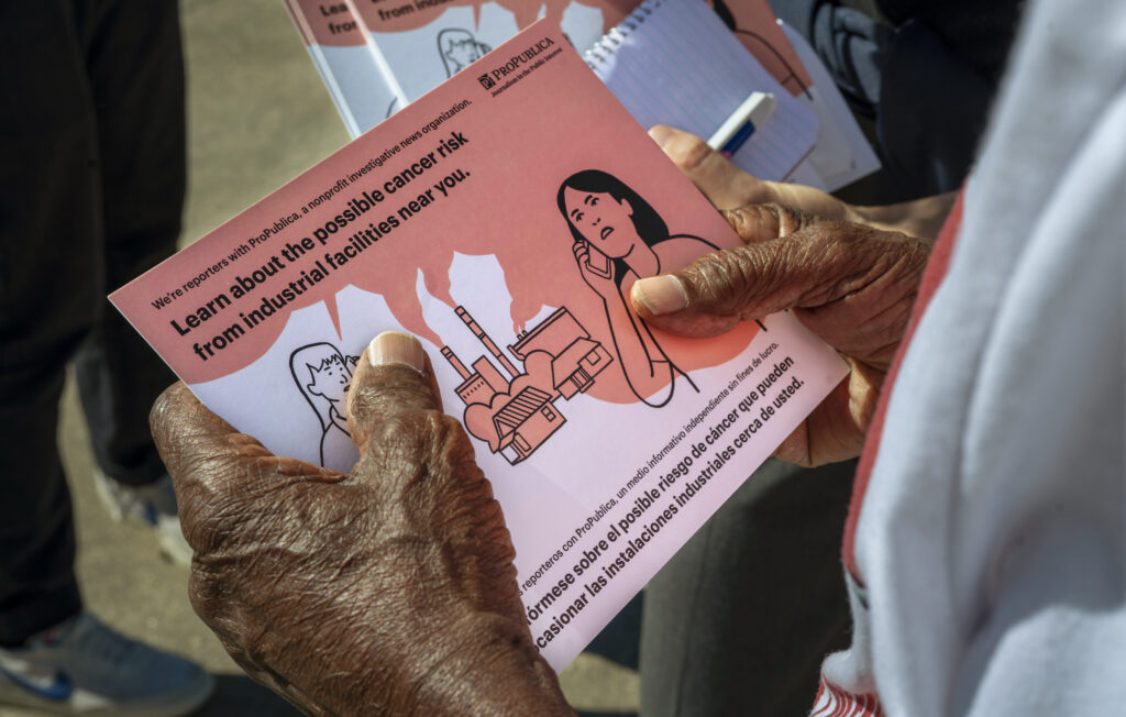
An accompanying series, “Sacrifice Zones,” explains the data and shines a light on the stories of people who live close to the factories.
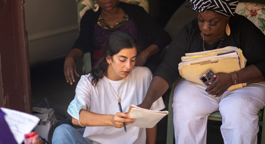
“I learned so much about bureaucracy and the ways that human beings are sort of collateral damage in the capitalist world economy really, because I think that what’s happening in the U.S. is also happening in many other parts of the world, probably much worse in many places,” says Lylla Younes, one of the lead reporters of the investigation at ProPublica.
In addition to Younes, the reporting team included Al Shaw, Ava Kofman, Lisa Song, Max Blau, Kiah Collier, Ken Ward Jr., Alyssa Johnson and Maya Miller.
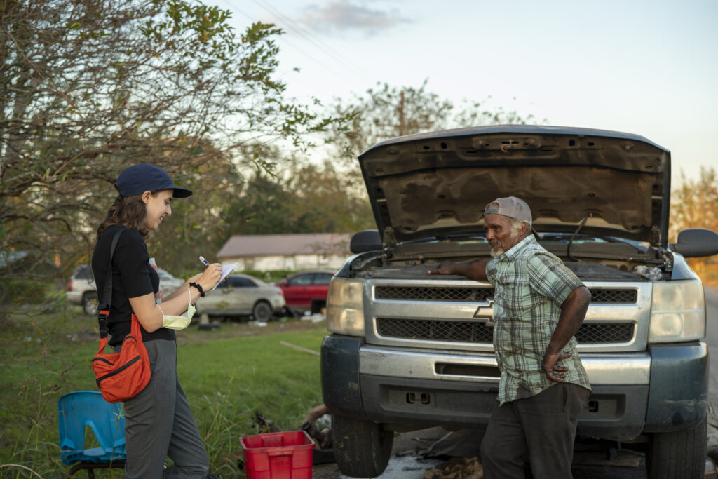
The ProPublica reporters also reviewed thousands of pages of corporate filings, filed nearly 100 public records requests, and interviewed dozens of workers, experts — including EPA insiders — and residents. On March 16, 2022, ProPublica released the data behind the series.
The project had an immediate impact. For instance, two days after “Poison in the Air” was published, the EPA announced that its administrator would tour the featured hot spots, a first-ever visit to some of the hot spots by any EPA head, according to ProPublica. In Texas, residents formed the Clean Air Laredo Coalition and pushed for school kids to have their blood tested.
Younes first came across a little-known EPA database, called the Risk-Screening Environmental Indicators model, in 2019. Her first story in collaboration with The Times-Picayune and The Advocate, “Welcome to “Cancer Alley,” Where Toxic Air Is About to Get Worse,” focused on just one state. (Editor’s note: The Times Picayune and The Advocate have since merged.) But then she started getting letters from readers who wanted to know what was happening in their neighborhoods across the country.
The Journalist’s Resource spoke with Younes about the project. The interview has been edited for clarity and length.
How did the “Sacrifice Zones” investigation come about?
I grew up in Central Louisiana. When I was a kid, I used to love driving down South Louisiana for swimming competitions, and my favorite part of the drive was when we drove through the chemical alley, because I just thought it looked so cool. As a kid, I saw those tall smokestacks and I thought it was really apocalyptic and out of all the sci-fi novels that I used to read. I used to ask my mom to slow down the car, so I could just stare out at all the machinery and the chemical tanks. And then when I got older, I started noticing that there is a darker side to that world. I learned the term Cancer Alley. People on my cross-country team and my cousins would complain about how the area made them nauseous and that they would get headaches when they competed there. (Editor’s note: The stretch of the Mississippi River between New Orleans and Baton Rouge got the nickname Cancer Alley decades ago because of its concentration of industrial facilities.)
I then started working in journalism later in life after moving to the northeast, and at ProPublica we did a partnership with The Times Picayune — now it’s called The Advocate — and pitched the story on air pollution in Cancer Alley.
And at first, we sort of struggled to get the story off the ground because it was a moment when a lot of other reporters across the country were covering the Cancer Alley and there was a lot of buzz. So we were kind of wondering, ‘OK, well, what can we bring to the table that hasn’t already been done here before?’
So, I started doing what I always do at the beginning of an investigation: Trying to understand the data landscape of an issue that I really knew very little about.
I discovered this dataset called RSEI, the Risk-Screening Environmental Indicators model, and I shared it with my colleague Al Shaw, and we were both sort of instantly amazed by its power.
How did you find the RSEI database?
It was the simplest Google search. I was just looking for U.S. government or EPA air toxic data and the first one that always comes up is NATA — the National Air Toxics Assessment — that has recently been renamed AirToxScreen. But RSEI (pronounced Ree-See) at first glance doesn’t seem like such a big deal. But then once you start reading about it, you realize, ‘Oh, wow, this could be extremely powerful.’
Can you talk a little more about RSEI? What makes it so powerful?
The RSEI tool is something that the EPA has been sitting on for 30 years. The public has been paying for it for 30 years, but nothing really substantial has been presented to the public in a way that is easy to understand.
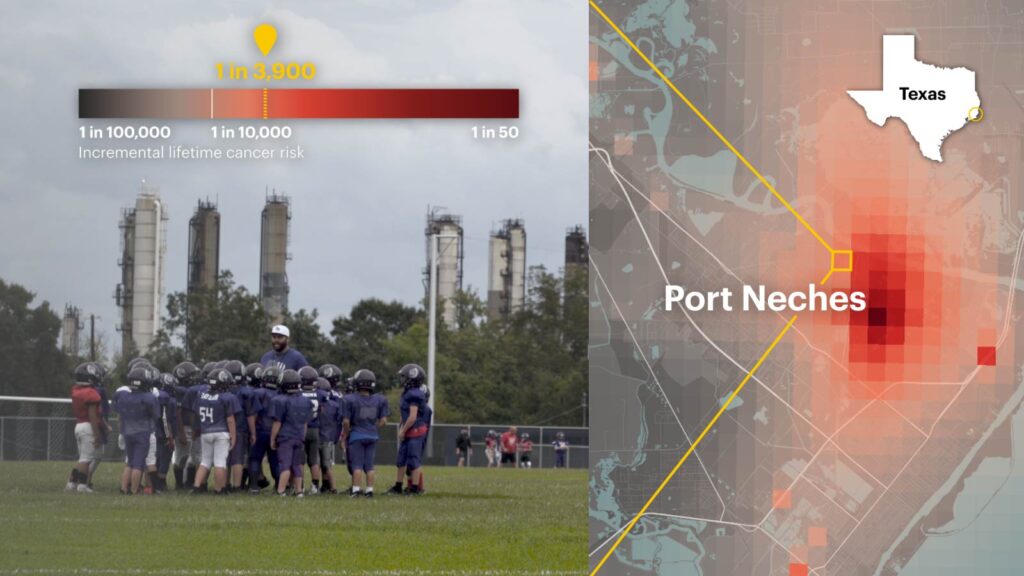
The tool estimates the actual concentrations of each individual chemical in the air, each industrial chemical in the air, at these really small slices of land. They are less than half-a-kilometer wide. So, you can actually see what’s happening at the level of the industry fence line; you can see what’s happening down the street from the plant.
The EPA go-to public data is usually aggregated at the level of a census tract. So, across the census tract in a rural part of the country, like Cancer Alley, emissions can vary widely and some of those census tracts can be huge and obscure impact on people living near the facilities. But these grid squares (on the RSEI tool) were so small.
I remember the first time that we actually mapped them, and saw it on the screen, our jaws dropped. We basically computed the cancer risk from the chemical concentrations, and we could see how it bloomed around the facilities and tapered out over the neighborhood — and at a really, really, high granularity. That was incredible to us, and we thought, OK, we have something here that nobody’s done before.
The RSEI dataset was massive. You had seven billion rows of data. How did you handle it?
The dataset was too big for a regular computer. Just one year of data is 120 gigabytes compressed, like in a zip file. So, we had to use a supercomputer to analyze them. We used a software called Google BigQuery. You can upload these huge data files into the Google Cloud, and you can run analysis on it. You have to pay for it based the amount of data you upload.
So, you got the dataset. What was next?
I remember I was sitting there in front of what we had done when we finally finished the data analysis, and Al Shaw and I were looking at what we had, and my editor, Ken Schwencke, told us, ‘Okay, write up a list of stories.’
And then we started to reach out to all the reporters in our newsroom who we thought might be interested, asking them what they thought, sharing the map with them, trying to gauge their interest.
And we suddenly had a team, and everybody was kind of running down their own lane, but we were all collaborating the whole time, sharing sources, sharing information, sharing news clips.
How did you decide which stories to tell?
When we looked at that map we saw stories that were screaming at us, (such as) the little town on the border of Texas and Mexico, which has a medical sterilization plant that was releasing ethylene oxide onto these elementary schools. Nobody in that town knew about that plant until we released this map, and now they have a coalition that they’re campaigning for children’s blood to be tested.
We obviously knew Cancer Alley was bad. But there were other places too that we kind of didn’t expect to look so bad. I worked with Max Blau on a story about BASF, the largest chemical company in the world, which, zooming out of the map, you kind of keep seeing that name pop up around the country. So, we decided to pitch a story on this German chemical giant that seems to have really taken root in the southern United States, and has all these factories there. We report on the supply chain of one American consumer product to show Americans that all of our hands are sort of involved into these toxic hotspots.
Ultimately, newsrooms around the country have used our map and continue to use it to write stories on toxic air pollution in their communities.
In your award application letter you explained that you decided to publish the cancer risk estimates even though the EPA warned that this could create unnecessary alarm. Can you talk about your decision to publish them anyway?
With the Louisiana project, we published percentiles: Your air pollution, your cancer rate is in x percentile of the country or the state. But our readers, I think they wanted the numbers. I think that percentiles were interesting, but not as clear cut as people were hoping for.
With the national project, we decided we were going to publish estimations of cancer risk and more than that, we were going to try to show people what a real chronic exposure looks like. In the Louisiana project we only looked at one year of data. For this project we looked at five years of data from 2014 to 2018, which was the most recent available data.
After dozens and dozens of interviews with current and former EPA staffers, we discovered that the agency has really struggled to, for a very long time, point fingers at industrial companies. But journalists are in a unique position to not have to fear the consequences of pointing fingers at the industrial companies. And that’s kind of where journalism takes power. And we also believe that we can present this information to our readers in a way that will be fully transparent and honest about our limitations.
We published not only a methodology, but also a story about that methodology. And we worked really hard on every word of language in the application (map) itself to make sure that we were showing people what we have, the truth and not sort of some extrapolation of that.
You also sent out post cards to residents. Can you talk about that?
We have a really incredible engagement team, always reminding us that the people are what matter and also trying to make these stories community-driven and community-involved. So, they have really innovative approaches and one of them is postcards. They have done postcards before; however, I believe that this was the largest postcard engagement that we’ve ever done, sending out more than 8,000 postcards.
(Editor’s Note: You can learn more about the efforts of the engagement team along with stories of several families in “When Home Is a Toxic Hot Spot.”)
How did the stories affect you?
And I think it’s just led me to really appreciate every little thing that I buy at the store. Every piece of plastic, you know, now I understand how it got into my home. And it’s been heartbreaking, to be honest.
It’s been so shocking to watch politicians celebrate these new plants, cover up for polluting industries, to hear the industry lobbyists sort of laugh at the words Cancer Alley. But then to visit the place and to see how some communities like Mossville, Louisiana, cease to exist, their history is completely erased as a result of toxic pollution. I mean, that’s something that to me is just staggering, and I don’t think that we even can begin to paint a real picture of what that must feel like to the people who’ve actually lived through it. I think we only can attempt to do that through these stories.
What’s your advice to journalists who are taking on data-driven projects?
Get to know the data as intimately as you would a human source that you are profiling for a year. Get to know the data inside and out. Don’t be afraid to push and to question it, and to twist its arm a little bit.
You need to make sure that you understand every limitation in the dataset. It will lead you to more stories. It will lead you to better stories. It will lead you to experts who not only know a lot about this but feel very strongly about the work that you’re doing. And it will lead to much more nuance. Maybe you won’t be able to come out with the headline of your dreams, but you’ll come out with something that is a far greater service to not only the public, but the individuals in these agencies that are trying to do the good work. As much as we dog on the EPA, there are people in an agency that care about this data and are trying to make it better. And when we do this work to the best of our abilities, we make it more possible for them to do their work to the best of their ability.
Read the stories
- You can find the entire series, “Sacrifice Zones,” here.
- Poison in the Air
- The Most Detailed Map of Cancer-Causing Industrial Air Pollution in the U.S.
- How We Created the Most Detailed Map Ever of Cancer-Causing Industrial Air Pollution
- Can Air Pollution Cause Cancer? What You Need to Know About the Risks.
- When Home Is a Toxic Hot Spot
- How Black Communities Become “Sacrifice Zones” for Industrial Air Pollution
- A Plant That Sterilizes Medical Equipment Spews Cancer-Causing Pollution on Tens of Thousands of Schoolchildren
- The Dirty Secret of America’s Clean Dishes
- What’s Polluting the Air? Not Even the EPA Can Say.
- Welcome to “Cancer Alley,” Where Toxic Air Is About to Get Worse
Expert Commentary