


When assessing academic studies, media members are often confronted by pages not only full of numbers, but also loaded with concepts such as “selection bias,” “p-value” and “statistical inference.”
Statistics courses are available at most universities, of course, but are often viewed as something to be taken, passed and quickly forgotten. However, for media members and public communicators of many kinds it is imperative to do more than just read study abstracts; understanding the methods and concepts that underpin academic studies is essential to being able to judge the merits of a particular piece of research. Even if one can’t master statistics, knowing the basic language can help in formulating better, more critical questions for experts, and it can foster deeper thinking, and skepticism, about findings.
Further, the emerging field of data journalism requires that reporters bring more analytical rigor to the increasingly large amounts of numbers, figures and data they use. Grasping some of the academic theory behind statistics can help ensure that rigor.
Most studies attempt to establish a correlation between two variables — for example, how having good teachers might be “associated with” (a phrase often used by academics) better outcomes later in life; or how the weight of a car is associated with fatal collisions. But detecting such a relationship is only a first step; the ultimate goal is to determine causation: that one of the two variables drives the other. There is a time-honored phrase to keep in mind: “Correlation is not causation.” (This can be usefully amended to “correlation is not necessarily causation,” as the nature of the relationship needs to be determined.)
Another key distinction to keep in mind is that studies can either explore observed data (descriptive statistics) or use observed data to predict what is true of areas beyond the data (inferential statistics). The statement “From 2000 to 2005, 70% of the land cleared in the Amazon and recorded in Brazilian government data was transformed into pasture” is a descriptive statistic; “Receiving your college degree increases your lifetime earnings by 50%” is an inferential statistic.
Here are some other basic statistical concepts with which journalism students and working journalists should be familiar:
- A sample is a portion of an entire population. Inferential statistics seek to make predictions about a population based on the results observed in a sample of that population.
- There are two primary types of population samples: random and stratified. For a random sample, study subjects are chosen completely by chance, while a stratified sample is constructed to reflect the characteristics of the population at large (gender, age or ethnicity, for example). There are a wide range of sampling methods, each with its advantages and disadvantages.
- Attempting to extend the results of a sample to a population is called generalization. This can be done only when the sample is truly representative of the entire population.
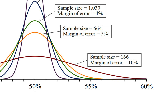
- Generalizing results from a sample to the population must take into account sample variation. Even if the sample selected is completely random, there is still a degree of variance within the population that will require your results from within a sample to include a margin of error. For example, the results of a poll of likely voters could give the margin of error in percentage points: “47% of those polled said they would vote for the measure, with a margin of error of 3 percentage points.” Thus, if the actual percentage voting for the measure was as low as 44% or as high as 50%, this result would be consistent with the poll.
- The greater the sample size, the more representative it tends to be of a population as a whole. Thus the margin of error falls and the confidence level rises.
- Most studies explore the relationship between two variables — for example, that prenatal exposure to pesticides is associated with lower birthweight. This is called the alternative hypothesis. Well-designed studies seek to disprove the null hypothesis — in this case, that prenatal pesticide exposure is not associated with lower birthweight.
- Significance tests of the study’s results determine the probability of seeing such results if the null hypothesis were true; the p-value indicates how unlikely this would be. If the p-value is 0.05, there is only a 5% probability of seeing such “interesting” results if the null hypothesis were true; if the p-value is 0.01, there is only a 1% probability.
- The other threat to a sample’s validity is the notion of bias. Bias comes in many forms but most common bias is based on the selection of subjects. For example, if subjects self-select into a sample group, then the results are no longer externally valid, as the type of person who wants to be in a study is not necessarily similar to the population that we are seeking to draw inference about.
- When two variables move together, they are said to be correlated. Positive correlation means that as one variable rises or falls, the other does as well — caloric intake and weight, for example. Negative correlation indicates that two variables move in opposite directions — say, vehicle speed and travel time. So if a scholar writes “Income is negatively correlated with poverty rates,” what he or she means is that as income rises, poverty rates fall.
- Causation is when change in one variable alters another. For example, air temperature and sunlight are correlated (when the sun is up, temperatures rise), but causation flows in only one direction. This is also known as cause and effect.
- Regression analysis is a way to determine if there is or isn’t a correlation between two (or more) variables and how strong any correlation may be. At its most basic, this involves plotting data points on a X/Y axis (in our example cited above, vehicle weight and fatal accidents) looking for the average causal effect. This means looking at how the graph’s dots are distributed and establishing a trend line. Again, correlation isn’t necessarily causation.
- The correlation coefficient is a measure of linear association or clustering around a line.
- While causation is sometimes easy to prove, frequently it can often be difficult because of confounding variables (unknown factors that affect the two variables being studied). Studies require well-designed and executed experiments to ensure that the results are reliable.
- When causation has been established, the factor that drives change (in the above example, sunlight) is the independent variable. The variable that is driven is the dependent variable.
- Elasticity, a term frequently used in economics studies, measures how much a change in one variable affects another. For example, if the price of vegetables rises 10% and consumers respond by cutting back purchases by 10%, the expenditure elasticity is 1.0 — the increase in price equals the drop in consumption. But if purchases fall by 15%, the elasticity is 1.5, and consumers are said to be “price sensitive” for that item. If consumption were to fall only 5%, the elasticity is 0.5 and consumers are “price insensitive” — a rise in price of a certain amount doesn’t reduce purchases to the same degree.
- Standard deviation provides insight into how much variation there is within a group of values. It measures the deviation (difference) from the group’s mean (average).
- Be careful to distinguish the following terms as you interpret results: Average, mean and median. The first two terms are synonymous, and refer to the average value of a group of numbers. Add up all the figures, divide by the number of values, and that’s the average or mean. A median, on the other hand, is the central value, and can be useful if there’s an extremely high or low value in a collection of values — say, a Wall Street CEO’s salary in a list of people’s incomes. (For more information, read “Math for Journalists” or go to one of the “related resources” at right.)
- Pay close attention to percentages versus percentage points — they’re not the same thing. For example, if 40 out of 100 homes in a distressed suburb have “underwater” mortgages, the rate is 40%. If a new law allows 10 homeowners to refinance, now only 30 mortgages are troubled. The new rate is 30%, a drop of 10 percentage points (40 – 30 = 10). This is not 10% less than the old rate, however — in fact, the decrease is 25% (10 / 40 = 0.25 = 25%).
- In descriptive statistics, quantiles can be used to divide data into equal-sized subsets. For example, dividing a list of individuals sorted by height into two parts — the tallest and the shortest — results in two quantiles, with the median height value as the dividing line. Quartiles separate data set into four equal-sized groups, deciles into 10 groups, and so forth. Individual items can be described as being “in the upper decile,” meaning the group with the largest values, meaning that they are higher than 90% of those in the dataset.
Note that understanding statistical terms isn’t a license to freely salt your stories with them. Always work to present studies’ key findings in clear, jargon-free language. You’ll be doing a service not only for your readers, but also for the researchers.
Related: See this more general overview of academic theory and critical reasoning courtesy of MIT’s Stephen Van Evera. A new open, online course offered on Harvard’s EdX platform, “Introduction to Statistics: Inference,” from UC Berkeley professors, explores “statistical ideas and methods commonly used to make valid conclusions based on data from random samples.”
There are also a number of free online statistics tutorials available, including one from Stat Trek and another from Experiment Resources. Stat Trek also offer a glossary that provides definitions of common statistical terms. Another useful resource is “Harnessing the Power of Statistics,” a chapter in The New Precision Journalism.
———————-
A special thanks to Sudhakar Raju of Rockhurst University for his invaluable contributions to this article. Keywords: training
Expert Commentary