


The world of open, Web-based tools and applications for reporting and communications seems to expand by the day, but it can be hard to keep track of what’s what, and which tools might be the most accessible for non-techies.
The good news is that developers are increasingly designing applications for the average user, someone with no programming skills.
These “off the shelf” products — many free and some open-source — make tasks do-able and efficient that would have taken huge amounts of time and money in years past. They are, in a sense, democratizing the ability to communicate on the Web.
The following are six useful tools to check out (and some related recommendations):
_______
Timeline JS: This free, open-source tool helps you build visually attractive chronologies. You simply fill out a Google spreadsheet template and drop in dates, links and associated media. The application’s Embed Generator then creates code that you cut and paste into your website, allowing you to host the timeline. Designed by Northwestern University’s Knight Lab.
StoryMap JS: Another free Knight Lab tool, StoryMap provides a straightforward user interface for marrying visual information with geographical displays — combining maps, text and pictures in compelling packages. It allows you to build narratives that walk audiences through landscapes and geographies, allowing stories to unfold through the given map. These can also be embedded on your website. Examples here. (In the map tools space, it’s also worth getting familiar with Ushahidi, a global platform where you can build maps collaboratively through crowdsourcing; and Google’s My Maps allows you to make quick, custom displays without any programming involved.)
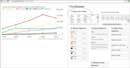
Chartbuilder: A free, open application, Chartbuilder was designed by the digital media outlet Quartz so that everyone in that news organization — not just specialists and developers — could quickly build data visualizations and embed them on their website. You can practice with some specific data here. Given some of the limits of Chartbuilder, which was just designed for lightweight, quick use, it’s also worth checking out Datawrapper.de, Charted.co and, of course, Google Charts.
Videolicious: Reporting and communications of all kinds could benefit from this tool, and it’s perhaps the easiest way to shoot, edit and package short videos with a mobile device. It’s intuitive and takes no audiovisual expertise or software. You can drop in still photos and add music. Examples are here and here. There is a free version for individuals; enterprise versions with more functionality are available, too. Fair warning: Videos must be very short. Videolicious also has ample instructional/how-to materials.
Piktochart: Create attractive infographics with this tool, which has an introductory free version with limited offerings and a $29 a month pro version ($40 a year for nonprofits), with hundreds of templates from which to choose. Fair warning: Good infographics are surprising difficult to create, and a lot of the hard work is narrowing your information and figuring out a delivery pattern. A tip from the research world: If you are trying to discuss controversial subjects or correct misinformation, infographics can help. (Some prefer competing applications such as Infogr.am or, especially, VennGage. All are worth trying.)
Gephi: Self-described as “Photoshop for data,” this open platform and graph-drawing software package has a lot of complex data analysis functionality and is used by many researchers, but it can also be deployed relatively easily to create and explore graphs of various kinds. Its greatest value is the ability to visualize networks in dynamic ways and the relationships between datapoints among social networks, businesses, and people and objects of all kinds (and analyze them statistically, if you are really geeky). Mind-blowing algorithms and features are baked in, making fascinating visualizations possible even if you are not a programmer. Caveat: Gephi’s interface requires some time and learning.
Final note: The multimedia aggregation tool Storify, which has been around for a number of years now, remains a very useful platform for pulling together tweets, photos, videos and more into a single stream/collage. Many organizations use it to cover and summarize trends and events.
Special thanks to Mike Reilley of Arizona State University and interactive developer Moritz Klack for their suggestions.
Expert Commentary