The notion that journalism should become more data-driven — and get a little closer to social science — is not a completely new idea. The journalistic sub-field of computer-assisted reporting, embodied in the work of the Investigative Reporters and Editors’ NICAR program, has a long history.
But a new suite of widely available Internet-based tools has made such a social science-journalism hybrid a real possibility for greater numbers of non-specialist journalists.
Though many journalists will continue to report in traditional ways, for all media members it is worth getting familiar with some of the new tools. And at the very least, knowing the basic contours of this rapidly evolving field can help reporters partner better with “hackers”; understanding the creative possibilities can lead to more fruitful collaborations.
“Data journalism is really just another way of gathering information,” says Steve Doig, Arizona State University journalism professor and data expert. “It’s the equivalent of interviewing sources and looking at documents, instead except with data journalism you are essentially interviewing the data to let it tell you its secrets.”
Harvard political scientist Gary King, one of the world’s leading academic scholars on data issues, has said he believes that “ultimately there is no line between journalists and social scientists. Nor is it true that journalists are less sophisticated than social scientists. And it is not true that social scientists totally understand whatever method they should know in order to access some new dataset. What matters in the end is that whatever conclusions you draw have the appropriate uncertainty attached to them. That’s the most important thing.”
To find out the secrets of the data, of course, you first need to obtain good data — not always an easy task. Then you need to clean it up, and then you need to analyze it. The most prominent analytic software — from industry-standard spreadsheet Microsoft Excel to statistical packages to Stata and SAS — is not free. (But you can always use open alternatives, such as Google Docs, OpenOffice.org, and R.) Most everything else is free, from the data itself to the tools required to make use of it and display it.
For those looking to educate themselves on data journalism broadly, one comprehensive place to start is the open-source, online guide The Data Journalism Handbook. Videos from the 2012 conference “The Story and the Algorithm,” sponsored by The Knight Foundation and the MIT Center for Civic Media, can serve as helpful and inspiring introductions. And in any case, having a basic grounding in statistical terms and concepts is a crucial first step. For a sense of what the world of data looks like up close, browse the Datasets page of the Pew Internet & American Life Project.
Data journalism fits in with larger societal patterns, of course, around such emerging concepts as “Big Data.” As the technologist Vivek Kundra has noted, the rapid accumulation of data combined with “network effects” has the potential for creating massively disruptive cultural shifts and innovations. The opportunities for the media to respond and capitalize in this area are significant.
The following is a brief overview of representative resources, sites and topics:
______
Open datasets
You can’t do data journalism without data. Fortunately, open data initiatives have gathered steam and currency over the past few years, and there are a lot of datasets that are freely available for download online. There also is a lot of data that is visible if not readily downloadable, and for that, data scraping tools can be very useful; ScraperWiki can help you build your own, or you can use a browser plugin like Scraper for Chrome, or Table2Clipboard or OutWit Docs for Firefox. (Tools like these can substitute for the defunct Needlebase, which Google scrapped in June 2012.)
 The United States government maintains its largest clearinghouse of data at Data.gov. Data.gov points to datasets maintained by individual U.S. government agencies, while also maintaining a large list of similar sites in different cities, states, and countries. From Data.gov, you can link to open data sites for countries from Canada to Kenya to France to Saudi Arabia; cities from New York to Toronto to Arvada; as well as NGOs like the OECD, World Bank, and United Nations.
Many of these open data sites are powered by a company called Socrata, including those of New York City and Kenya, and Socrata maintains a list of open data sites that use its software.
Demographic data are also plentiful. The Census Bureau maintains DataFerrett, a Java-based tool that allows researchers to access a deep archive of many of its surveys, including the American Community Survey, Current Population Survey, and decennial census. The University of Minnesota maintains IPUMS, which houses much of that data, as well as other data on health, North Atlantic population, and more.
Many other sites offer numerous data sets in different topics, but the offerings are often more scattershot than comprehensive. These sites include the IQSS Dataverse Network at Harvard University, The Data Hub, Google Public Data, data360.org, Knoema, and datacatalogs.org.
Data cleanup
A good text editor is invaluable for understanding and cleaning data. On Macs, TextWrangler is terrific. It has incredibly robust search and find and replace capabilities, capable of editing a dataset with hundreds of thousands of records in a couple of seconds. Windows users have many other options, including Notepad++.
Google maintains a data cleanup tool, Google Refine, which can be helpful in cleaning up very large data sets, using cluster analysis to identify possible typos and misspellings, and other possible inconsistencies or irregularities in the dataset. It runs in your browser, but it downloads to your computer. Dan Nguyen wrote a good primer for using Refine over at ProPublica’s Nerd Blog.
Data visualization
Muse can help you comb through an archive of emails to find common threads (check out the Lab’s TimeFlow tool, as well). Like Google Refine, it downloads to your computer (so you don’t have to upload the data to the cloud), but it runs in your browser.
StoryMap JS, from Northwestern University’s Knight Lab, has rich functionality and features to help tell deeper stories around geolocated datasets.
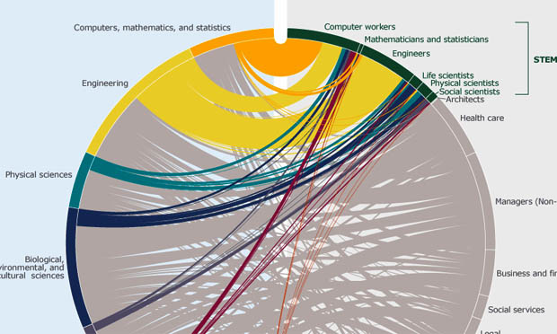
 IBM’s Many Eyes can beautify your data by showing it in a number of different ways, from histograms to word clouds to network diagrams to maps, but be aware that it requires you to upload your data publicly so that everyone else can see it.
Google Fusion Tables allow you to combine your data with visualizations, like maps and images. It requires you to upload your data to the cloud, but you don’t have to make it visible.
Guardian’s Datablog mentions a number of their reporters’ other favorite visualization tools, including Tableau Public, Datamarket, and Color Brewer (useful for designing map colors). DailyTekk lists even more tools here.
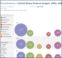
The Center for Digital Information, which promotes the packaging of policy research in more Web-accessible formats, curates some great examples of visualizations.
More to read
As always, the way to become a better data journalist is to read good journalism. Texas Tribune and ProPublica have been justly lauded for their data work. The Guardian’s Datablog, updated daily, provides engaging visual analyses for stories in the news, and links to all the data they use; there’s even more at the Guardian’s Datastore. IRE, the organization of Investigative Reporters & Editors, also has a blog that points to investigative reporting by its members.
The Journalist’s Toolbox has a long and useful index of related tools, applications and industry sites.
Other nonprofit organizations have gotten into this field, doing their own analysis and boosting possibilities for journalism in data-intensive areas. The Sunlight Foundation has several projects, including “Follow the Unlimited Money,” on political ads, and “Party Time,” which tracks political fundraisers. The National Institute on Money in State Politics maintains Followthemoney.org, a resource tracking contributions to state-level campaigns. Similarly, the Center for Responsive Politics started OpenSecrets.org, which tracks lobbying dollars at the federal level.
Good data is the beginning of the story, not the end of the story. Once the dataset is clean and visually colorful, you can try to report on what’s really going on. “You have to look at patterns in the data, and then go back to doing traditional reporting,” ASU’s Doig notes, “finding people who were affected [and] experts on the subject to explain their interpretations of the patterns in the data.” Which is all to say that data doesn’t take the shoe-leather out of reporting — it just gives a reporter a better map.
Tags: training, data journalism


Expert Commentary