There are many ways to visualize data these days, as well as an increasing number of places from which to draw datasets. But it’s not always easy to figure out the shortest path to production for media use, especially on deadline. Here, we’ll focus on just one use case, the classic time-series graph — the display of the change in a variable, or variables, typically over hours, days, months or years.
Some quick context: Recently, we posted an article on organic farming and how the public understands the meaning of the term “organic.” The United States Department of Agriculture helps “certify” farms and their products so they can use the label “organic” on their products.
We know that sales of organic products have generally continued to climb in recent years, despite the fact that the public doesn’t always understand what it is buying. But how is the underlying U.S. farming landscape changing accordingly? How many acres are being dedicated to organic crops?
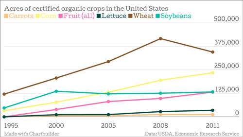
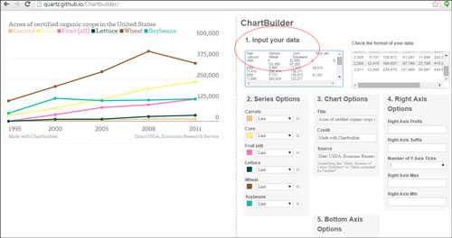
The following was made using Chartbuilder, a tool created by Quartz, derived from statistical estimates from the USDA’s own internal data collection agency:
The procedure for producing this chart is reasonably straightforward:
1) We went to Data.gov and searched for “organic crop.” That brought us to a USDA landing page with lots of related datasets. We then hit “download” on Table 3, which had the acreage estimates, and got an Excel spreadsheet with a bunch of rows and columns relating to all manner of organic certified crops and the extent of their acreage. Below, you can see a snapshot of one piece of it:
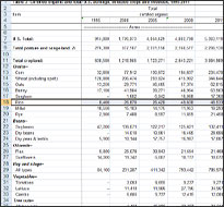 2) OK, so you have a spreadsheet with loads of interesting data. But how to make it usable — and quickly?
The first order of business was to look at the data and observe the trends. We’re not doing data science here, and we’re only looking for illustrative data to provide some context around the rise of organic produce. It’s the kind of chart that could plausibly accompany a daily story — nothing too fancy. Crops of all kinds are generally seeing growth in the number of acres dedicated to organic certified. Each row (the horizontal fields) supports that observation. There is of course wider and potentially important analytical context included in the dataset — trends in cropland more generally, and percentage changes in organic relative to overall acreage — but we’re keeping it very simple here.
We decided to focus on six somewhat-representative crops here; we couldn’t include everything, and wanted to exclude crops that aren’t recognizable to the average reader. Those are all journalistic decisions, made based on what we thought might communicate meaningfully to the general audience.
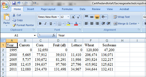
3) To get this data into the proper format to make it a time series, however — to clean it up — we had to flip or “transpose” it, so that the date range was descending in the first column (the vertical field).
We highlighted the row of data in the original and copied it. We then opened up a new sheet (tab at the bottom of the Excel file) and hit “Paste Special” and clicked “Transpose,” so that it looked like this (after rearranging the items in alphabetical order):
4) We then had the basic form of the data we needed. Excel has functionality to visualize this in a chart and insert a line graph, but we wanted to use an easy and intuitive tool that many journalists have found helpful, Chartbuilder. We just cut and pasted the cleaned-up data from Excel into the designated field in Chartbuilder (circled below) and then adjusted the colors and put proper sourcing labels in the “Chart Options” field. We adjusted the Y (vertical) axis a bit so the units represented were sufficiently fine that they provided useful information.
5) You can then simply hit “Create Image of the Chart” in the Export field and plug the chart right into your article/website. A delicious (and healthful) data snack….
Keywords: data journalism, data visualization

Expert Commentary