


Was Oakland the nation’s most dangerous city in 2013? Or was it Oakland and Flint? What is a valid distinction, statistically speaking? We show the uses of a “confidence interval.”
Journalists love rankings and lists, especially when they involve public data that show how certain states, cities, zip codes or neighborhoods compare against one another. But when journalists select angles, write leads and craft headlines, inevitably some amount of nuance — and potentially truth — gets left behind in the act of compression.
When the weight of the data is overwhelmingly in one direction or another, the “story” can almost write itself, and accurately. For example, let’s say a researcher finds that 74 percent of U.S. transportation fatalities take place on highways, and of those, 10 percent are motorcycle riders. Here, writing a lead and headline are relatively direct, and likely to be reflective of what the data are saying.
But what about cases where there’s less clarity in the data — how do we weigh significance and make close calls? Below is a simple example of data journalism with a few straightforward statistical techniques that can help reporters and editors make more accurate decisions when there is some ambiguity — and a borderline “call” — inherent in the numbers.
The attached Excel spreadsheet contains 2013 crime data from 269 cities across the United States. This nicely cleaned-up table is courtesy of Investigative Reporters & Editors (IRE), and comes from its Data Coursepack. As IRE notes, there are all sorts of fundamental issues with using this dataset:
The Federal Bureau of Investigation has been collecting crime data from law enforcement agencies in the United States since the 1930s. The FBI discourages against ranking cities based on this data for many factors. First of all, reporting is voluntary and while the FBI provides guidelines on data collection they are not rules. Just a fraction of law-enforcement agencies report to the FBI and they may collect information differently or have different definitions for offenses. Additionally, cities such as Detroit and St. Louis often float to the top of rankings because the cities are their own counties and don’t include any suburban areas in the offense totals. While journalists need to be aware of these caveats, FBI crime data remain the best tool we have for analyzing this information across the country.
With these caveats in mind, let’s look at the IRE’s dataset and try to use it to answer a classic question: Which city is the most dangerous? If you eyeball the list and the highest rates (see the Media/Analysis tab on this post for the formulas), you’ll see it’s a close call near the top:
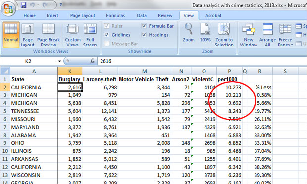
If you’re a reporter in Michigan, you’d note that both Flint and Detroit are in the top 10, so the story could be their ongoing troubles with public safety. But what if you’re writing a national story? Just by going from the numbers, the most dangerous city (based on this dataset), is Oakland, California, with 10.27 violent crimes per 1,000 residents. But is it fair to run a story that says, in effect, “Oakland Is Nation’s Most Dangerous City”? Oakland is definitely in the unenviable top position, but the margin between it and Flint, which has 10.21 instances of violent crime per 1,000 persons, seems pretty slender. And what about Detroit, at 9.69? How meaningful are the distinctions between these cities, and how should they be interpreted in order to focus the story?
When you’re working on deadline, you don’t often have time to do a full statistical analysis, so rules of thumb can be helpful, keeping in mind that they’re only that. In this case, what’s the percentage difference between crime rates for Oakland and the cities lower on the list? Here’s how to calculate:
- 1) In cell S3, type in the formula “=P3/$P$2” — here you’re dividing the crime rate in Flint by that in Oakland. (The dollar signs in the formula mean “keep this reference point fixed”; it’ll be important later on.) After the formula is in place, right-click on the cell, select “format cells,” choose “percentage,” set the number of decimal places to two, and press OK. You should see 99.42 percent. So, Flint’s violence rate is very close to Oakland’s, something you could see just from the raw numbers, but here it’s in percentage terms.
- 2) To find out how much lower Flint’s violence rate is than Oakland’s, type the formula “=1-(P3/$P$2)” in cell R3. The result should be 0.58 percent. (You could have derived this with a calculator by subtracting 99.42 from 100, but it’s easier to let Excel do the work.)
- 3) Copy the formula in cell R3 and paste it into R4 through R270. You’ll now get percentages expressing the difference between Oakland’s rate as compared to each other city.
Just looking quickly, you can see that the rates for Oakland and Flint are very close, just 0.58 percent apart — not even 1 percent. Detroit’s is 5.66 percent lower than Oakland’s rate; Memphis is 19.77 percent lower; St. Louis is 26.11 percent lower, and so on, all the way down to Irvine, Calif. Its violent-crime rate is 0.27 per 1,000 — 97.36 percent lower than that for Oakland.
So in the column of results that we have, when does the difference in the rate of violent crime become “significant,” statistically speaking? In the broadest possible terms, the figure of 5 percent can be a helpful guideline. A smaller difference is questionable, though there are a lot of potential subtleties — for example, how bunched up or spread out are the values? Hard to say, just looking at the data quickly. Consequently, we need to derive our answer in a more rigorous way, based on all the observations in the dataset. Only this will allow us to better understand the numbers and, based on this knowledge, write with more authority.
All that’s required is a few more of the built-in formulas that Excel and other spreadsheet programs make available:
- 1) At the bottom of your spreadsheet, in cell N272, type the word “Count.” In P272, type “=COUNT(P2:P270)”. This gives you the number of values that we have in this dataset. (Note that you could just type in 269 here, but using the COUNT function would allow you to, say, easily exclude some outlying data points to ask slightly different questions.)
- 2) In cell N273, type the word “Mean” or “Average” — it’s just a label. Then in P273, type “=AVERAGE(P2:P270)”. Once the formula is in place, right-click on the cell and format it as a number with three decimal places. This gives you the average violent-crime rate per 1,000 people for our dataset: 2.686 per 1,000.
- 3) In cell N274, type the label “Standard Dev.” and in P274, “=STDEV(P2:P270)”. This uses a built-in Excel formula to calculate the standard deviation, which tells us how much variation the dataset contains — are the numbers tightly bunched or spread out? The answer is 1.818.
- 4) In cell N275, type “Standard Error” and in P275, “=(P274)/(SQRT(P272))”. Here we’re dividing the standard deviation in cell P274 by the square root of the number of data points. The more data points we have, the lower our standard error, the fewer data points, the greater the standard error. In this case, it’s 0.111.
- 5) In cell N276, type “Confidence Int.” and in P276, “=CONFIDENCE(0.05,P274,P272)”. Another built-in function, with the level of significance we’re choosing (0.05, or 5 percent, in this case), the standard deviation we calculated in cell P274, and the number of data points shown in cell P272. The result is 0.217.
What the confidence interval means is that for any one value in the list of violence rates, from Oakland to Irvine, those that are 0.217 greater or lower have a 95 percent probability of being statistically different. This being the case, let’s find out how far around the average of 2.686 the 95 percent confidence interval extends — what’s the range of “average” in our sample.
- In cell N278, type “Minimum” and in cell P278, “=P273-P276.” This is the average minus the confidence interval, and the result is 2.469.
- In cell N279, type “Maximum” and in cell P279, “=P273+P276.” This is the average plus the confidence interval, and the result is 2.903.
So for our story, it turns out that the cities with rates of violent crime closest to the national average, 2.686, are Seattle, Washington (2.702), and Lowell, Massachusetts (2.681). Twenty-nine of our cities, from Manchester, New Hampshire (2.899) to Reno, Nevada (2.473), are within 95 percent confidence interval for our mean — their rates are statistically indistinguishable from the average crime rate, meaning they’re effectively the same, at least based on the available data. Given that we have 269 cities, they’re actually fairly tightly bunched: 10.78 percent are within the confidence interval for the mean.
And back at the top of the scale, our more-involved calculations tell us that the rates for Oakland and Flint are effectively identical, and significant outliers. Only when do you get to Detroit, whose rate of 9.62 is 0.581 less than Oakland’s — more than the 95 percent confidence interval of 0.217 — does the difference become significant, statistically speaking.
So then the question becomes, what is the story that the data is telling us? Here are possible headlines, all of them statistically accurate — and defensible:
- “Oakland, California and Flint, Michigan lead nation in violent crime rates.” The rate for these two cities is more than five times the average for all cities examined.
- “Philadelphia and Houston the most dangerous U.S. cities over 1 million; San Diego and Phoenix the safest.” To arrive at this, we sorted by population, then sorted just the cities over 1 million in population on their violent-crime rates.
- “New York: Big city, but violent crimes close to U.S. average.” The city’s rate is 2.929, just beyond the 95 percent confidence limit of 2.903. But looking above New York in the list, there are a lot of cities thought of as “safe” whose violence rates are significantly higher than New York’s (meaning, at least 0.217 higher, our confidence interval), including West Palm Beach, Florida (3.163), Tucson, Arizona (3.178), Peoria, Illinois (3.227) and Spokane, Washington (3.398).
The bottom line: Quick calculations are handy, and can help you in a deadline situation, but it’s always better to really dig into the numbers, even when you have a small amount of time. There are often a lot of great stories there, and far more worth telling than the simplistic read of a column of values.
Related resources: Two other Journalist’s Resource tip sheets can provide more information on data analysis: “Statistical Terms Used in Research Studies; a Primer for Media” and “Regression Analysis: A Quick Primer for Media on a Fundamental Form of Data Crunching.”
Expert Commentary