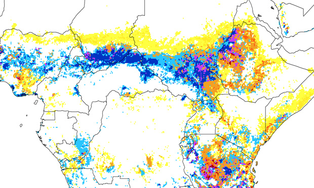
While data journalism can take many forms, mapping is perhaps the most basic and accessible way to create meaning graphically to help audiences understand stories and issues in new ways. It is, of course, one of the oldest forms of data visualization, with a history that stretches back centuries, even millennia.
But to get started, what should you know about this field? Let’s break it down.
Google Maps is an obvious place to start. An exercise such as mapping favorite local restaurants or places to visit can get beginners familiar with the interface and functionality of the application. The next level up in terms of complexity for Google products is Fusion Tables — take a basic tutorial and practice with a lesson on how to build an “intensity map.”
Fusion Tables allow you to load datasets that have geo-markers, addresses or coordinates and automatically place them on a map. As an alternative tool, you might try BatchGeo, which allows you to make a Google Map by simply loading in data. For creating interactive stories with multimedia, try StoryMapJS, a free application that has allowed many reporters and editors to tell creative stories with a geospatial dimension.
Key terminology
The ability to load data into mapping applications is crucial, as it’s the only way to work with larger datasets. Data formats and structures are all-important in mapping. There is a lot of jargon and many multi-lettered terms, but most of it is straightforward for simple mapping purposes.
In general, data that you load into applications and tools will be in “CSV” format, a comma separated values file. Excel files can be converted into CSV files and vice versa. Depending on the mapping tool you are using, and your purposes, you may need to have more than just columns for a street address, town/city, state and zip code. Longitude and latitude coordinates are sometimes necessary. OpenStreetMap is a popular source for free, global geospatial data, available for download.
You should also know about “shapefiles,” which allow you to mark out areas — points, lines, polygons — that might relate to, for example, particular neighborhoods within a city, rivers or lakes, or other regions that need to be defined by information not describable by, for example, street addresses. Let’s say you want to show how violent crime is distributed across a big metropolitan area, and you need to create a layer that shows all of the traditional neighborhood boundaries. You should search the Web to see if there is a shapefile that might have been created to lay out those areas geographically. If you want to make a “shape” or polygon of some sort and can’t find one for the neighborhood you want to define, you might try GeoJson.io, where you can identify areas and download files accordingly.
Finally, you should be aware of “KML” files (Keyhole Markup Language), which are structured files containing longitude and latitude that allow for use in various geospatial information systems (GIS) applications such as Google Earth or Carto.com.
Carto, Tableau, ArcGIS
Formerly known as CartoDB, the Carto.com platform is becoming a go-to resource for journalists and map makers of all kinds. As with many mapping applications, Carto transforms the data into a unique structure to facilitate accurate placement of geographic points of interest. It is well worth taking a Carto tutorial to familiarize yourself with its functionality: You can proceed through Carto’s easy-, medium-, and advanced-level tutorials.
In terms of other popular tools with very sophisticated capacity, you might also try out Tableau Public and ArcGIS, from the geospatial company Esri. These tools are used by professionals in many disciplines. For more advanced digital cartography, journalists use platforms such as Leaflet and Mapbox, which allows for customization and for the hosting of map tiles — the grid of images that make up a map that needs to be refreshed every time one zooms in or out.
Additional resources:
See Journalist’s Toolbox for a comprehensive list of mapping tools.
David Herzog of the University of Missouri has provided a great overview of applications and tools at various levels.
Storybench.org, from Northeastern University, has published tutorials for producing animal tracking and weather maps with Carto, as well as “choropleth” maps with barely any code.


Expert Commentary