

On May 12, we published a methods paper and a corresponding blog post that introduced a new way to calculate recent detained population numbers at U.S. Immigration and Customs Enforcement detention facilities. We call this number Interval Average Daily Population (Interval ADP), and we believe it’s a more accurate and timely facility-level data point than what ICE currently provides in its biweekly detention spreadsheet.
These numbers are now ready to be used in news reporting, policy papers, and other public interest work where both recency and accuracy matter.
If you haven’t already, we recommend reading our May 12 blog post before diving into the information shared below. For those interested in the technical aspects, the methods paper provides a full breakdown of how the numbers are calculated.
“This method is not perfect,” we explain. “This approach still does not answer the question of how many people are being held in individual detention facilities on any given day. We have not compared our estimates to maximum capacity at each facility to evaluate whether ‘overcrowding’ is occurring. Our full methods paper discusses other caveats and considerations for anyone attempting to reproduce this analysis.
“Nevertheless, this relatively simple calculation will be useful to many researchers, reporters, and members of the public — regardless of political perspective — who are interested in understanding the effects of heightened immigration enforcement on the detention system.”
On May 14 we continued our exploration by publishing the latest facility-level population estimates for the April 14 to April 28 reporting interval. In this post, I’m sharing tables and graphs based on those estimates, which I encourage you to share with your own audiences.
All the data in this post can be downloaded directly from each Datawrapper table or chart below. We’re also working on a public GitHub repository that will include all the data, code, and explanatory materials used in this work.
Since the graphs and tables below are fairly large, we’ll give a quick summary of what’s included below:
- A comprehensive table showing facility-level data for every ICE detention center currently in use.
- A graph showing the differences between ICE’s Reported ADP and our Interval ADP estimates.
- A graph highlighting facilities with the greatest discrepancies between the two ADP measures.
- A table of new ICE facilities that appeared for the first time in the most recent detention spreadsheet.
Interval ADP by ICE facility
The comprehensive table here includes every detention center ICE is currently using. It shows the name of each facility, its city and state, the date the data was current, ICE’s Reported ADP, our Interval ADP estimate, and the difference between the two. All numbers have been rounded to integers.
We’ve highlighted the facility name and Interval ADP columns to make it easier to find the most relevant figures. The table is searchable and sortable, and the underlying data can be downloaded. Datawrapper also allows you to download an image of each chart, export the underlying data, or embed the visual directly into your own articles.
As with all materials in this post, you’re welcome to share or embed this content with attribution. You do not need to get additional approval from us to use these figures, but we would be grateful if you sent us the final version of how this work is used so that we can learn from it.
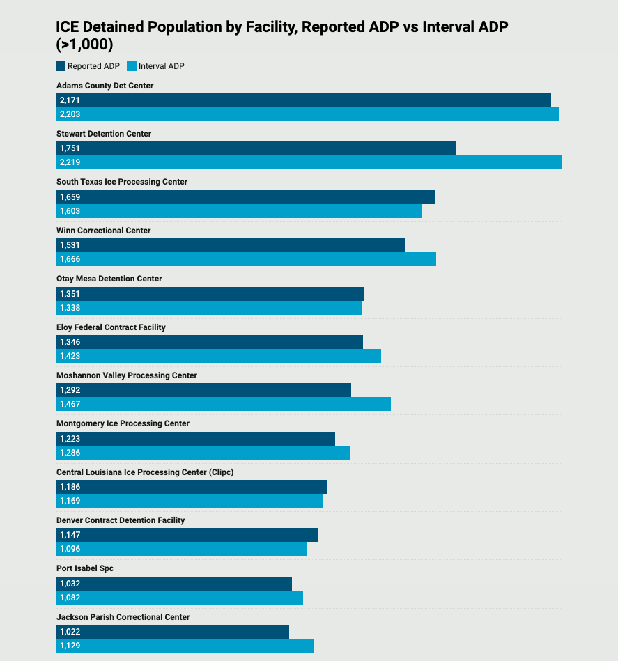
Interval ADP for ICE’s largest facilities
The figure below shows recent detained population estimates for facilities holding more than 1,000 people. As we noted in our previous post, the Interval ADP for some facilities stays close to the fiscal-year average, while others show significant deviations. Stewart Detention Center and Moshannon Valley Processing Center were discussed earlier. Additionally, you’ll notice that for some facilities, recent population numbers are actually lower than their year-to-date averages.
Interval ADP for facilities with the largest discrepancies
This figure focuses on facilities with the largest discrepancies between ICE’s Reported ADP and our Interval ADP. In many cases, these differences reveal sharp spikes in the detained population. For example, Butler County Jail is holding about 237 people per day for ICE right now, nearly 6 times ICE’s Reported ADP number.
For reporters, advocates, or researchers, this figure may provide a timely signal for where to focus attention. These differences are also reflected in the comprehensive table above.

New additions to ICE’s detention network
The final table lists five detention centers that appear in ICE’s data for the first time. Because they’ve only just come online, we can’t calculate an Interval ADP for them yet — we’ll need at least one more data point before we can do that.
Still, the appearance of these new facilities is telling. Given the rapid growth in ICE’s detained population this year, it’s no surprise that the agency is actively bringing more facilities into use to detain more immigrants.
Advice for writing and reporting about immigration data
If you are using these data in your writing — whether as a researcher, student, journalist, blogger, lawyer, analyst, etc. — here is some additional information about the data and some tips for how to represent these numbers accurately.
About the math behind this calculation: We recognize that writers have varying levels of comfort when it comes to working with data. Working with administrative immigration data, in particular, adds conceptual prerequisites that are sometimes more prohibitive than the math itself. We want to reassure writers that the calculations themselves for Interval ADP involve only basic algebra and are easily duplicated — which should lend legitimacy and transparency to the data even if you do not duplicate our findings yourself.
About the data behind the calculation: The data used here is published by the government; we do not include any external (i.e., non-governmental) data in our calculation. These are not “our” data that we collected or inferred — this is ICE’s own reported data.
About Interval ADP: Interval ADP is simply the average daily population at a facility during a specific time period, usually two weeks (14 days). It is not the actual population of a facility on a specific date.
Writing about Interval ADP: Understanding what you can say, and not say, when writing about immigration takes experience and background knowledge. Even seemingly minor terms have a precise meaning in the immigration system and similar phrasings may actually connote very different things. Here are some samples of how to write about ICE’s detained population using our Interval ADP calculation, with pros and cons of each.
✅ “According to ICE’s public detention data, Stewart Detention Center held about 2,219 people per day between April 14 and April 28.” — This is the simplest way to be precise and accurate, but the additional details may render it slightly clunky depending on the context and may obscure the additional work of calculation.
✅ “Using ICE’s public detention data to calculate Interval ADP reveals that Stewart Detention Center held about 2,219 people per day between April 14 and April 28.” — This is accurate and slightly more transparent about the underlying method, but, again, the additional details may render it slightly clunky depending on the context.
✅ “Stewart Detention Center currently holds about 2,219 people per day.” — This is the simplest sentence that I would characterize as defensible, as long as the number used here represents the calculation for the most current detention spreadsheet posted on ICE’s website. We could quibble over what counts as “current”, but as long as ICE’s spreadsheets continue to be released every two weeks or so, I would describe that as “current.”
❌ In the examples above, removing the words “currently” or “about” as important caveats would feel overly definite, and is discouraged.
❌ “Stewart Detention Center currently holds 2,219 people.” — This is inaccurate because we do not know how many people are held on any single day, we only have averages over a recent time period.
❌ “The Trump administration is hiding the true number of immigrants held in each facility.” — At least as it concerns our research here, we emphasize that the discrepancies between Reported ADP and Interval ADP are not a result of any observable meddling in ICE’s detention reporting by the Trump administration. While it is true that ICE’s longstanding calculation does, indeed, obscure or hide recent facility-level populations, it is not necessarily true (based on what we have seen) that this is a result of an intent to mislead. Rather, it appears to be a consequence of the method of calculating and representing facility-level populations.
An earlier version of this commentary first appeared on Austin Kocher’s Substack page. We’ve updated and republished it with his permission.
Expert Commentary